Just loading...
Tutor for the Interaction Design graduate program at The Design Lab, University of Sydney. I get my kicks from strategising, problem solving, and creating through design research and innovative thinking. I believe every design problem is unique, that assumptions are dangerous and must be challenged, and that as a designer I have a responsibility to the user to avoid bias. I'm an idea-enthusiast with an understanding of business. My skill set is diverse, from FMCG business and marketing experience (taking products to market and managing stakeholder expectations) to coaching Track and Field as a former athlete. Each has given me an invaluable understanding of what good leadership entails, how to make sound decisions under pressure, and to view setbacks as challenges.
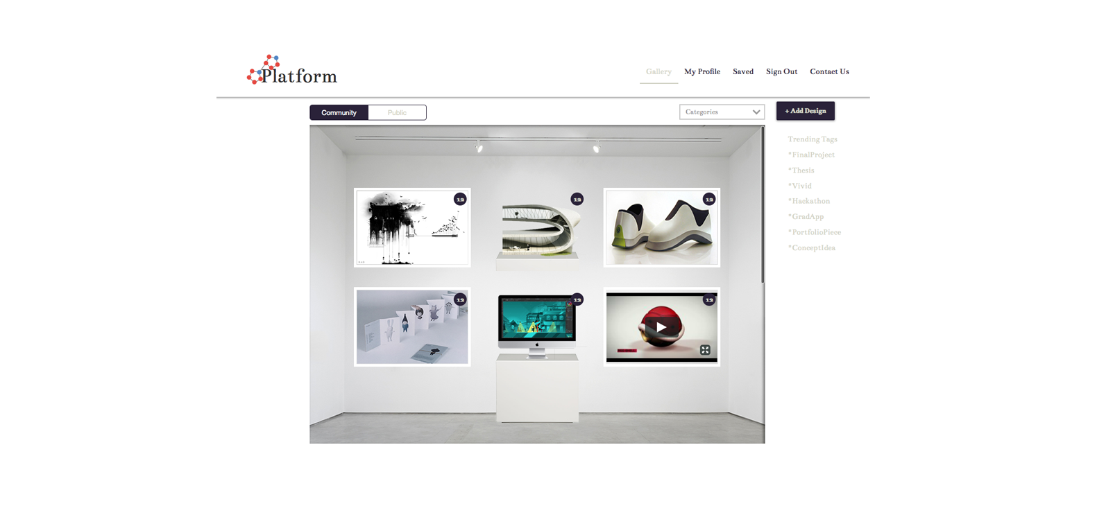

Members of a University Design Faculty sought a way to connect outside of classes. The faculty offers an array of specialties, for students working tirelessly throughout the year to excel in. The solution would allow this innovative work to be shared by connecting students from varied degrees with each other, members of faculty and other interested parties. To do this, a complex web and mobile platform that acts as a library and community for designers needs to be created, with a useful and friendly interface for user-generated content.
I went right back to basics to explore the original method of storing knowledge: the Library, to better understand its modern extension: the Digital Database. I looked at theories of historical figures like Vannevar Bush, Douglas Engelbart and Tim Berners-Lee, on how and why information should be organised and shared on digital platforms. Papers on what makes a system “useable” and why I need to know my target audience, when seeking to integrate online communities through the collaboration of ideas. I used these findings to compare and analyse design precedents of university and professional portfolio sites with consolidation sites, like vox.com.
The three key stakeholders identified are students, faculty and industry designers. Representatives from each were interviewed using structured, customised, and open questions with further probing to encourage elaboration. The interviews were used to understand each user’s experience when exploring a competitor’s site.
Both forms of research were used to identify the key needs of the potential user to develop a user persona and journey. This was then used to highlight the specific elements required of the product.
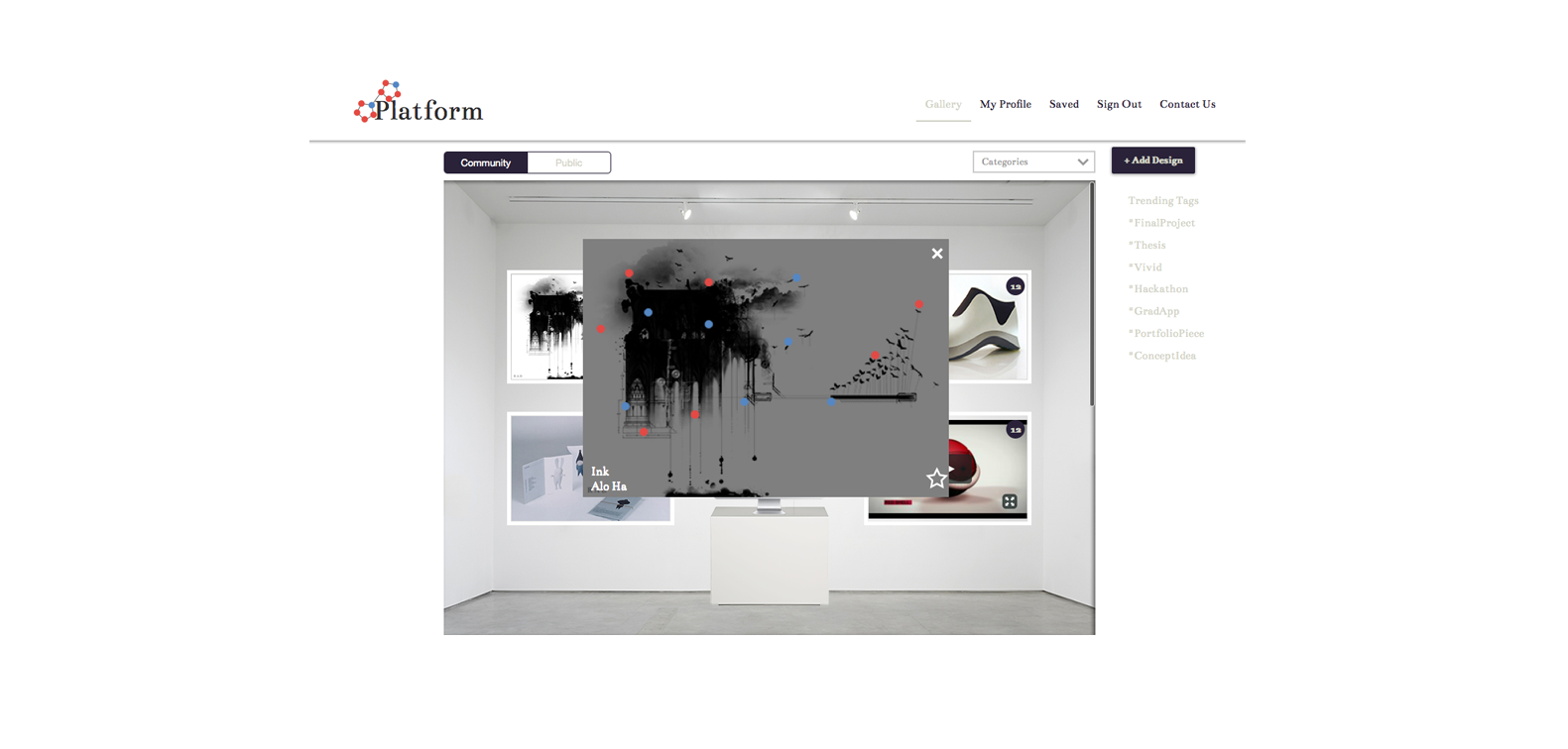
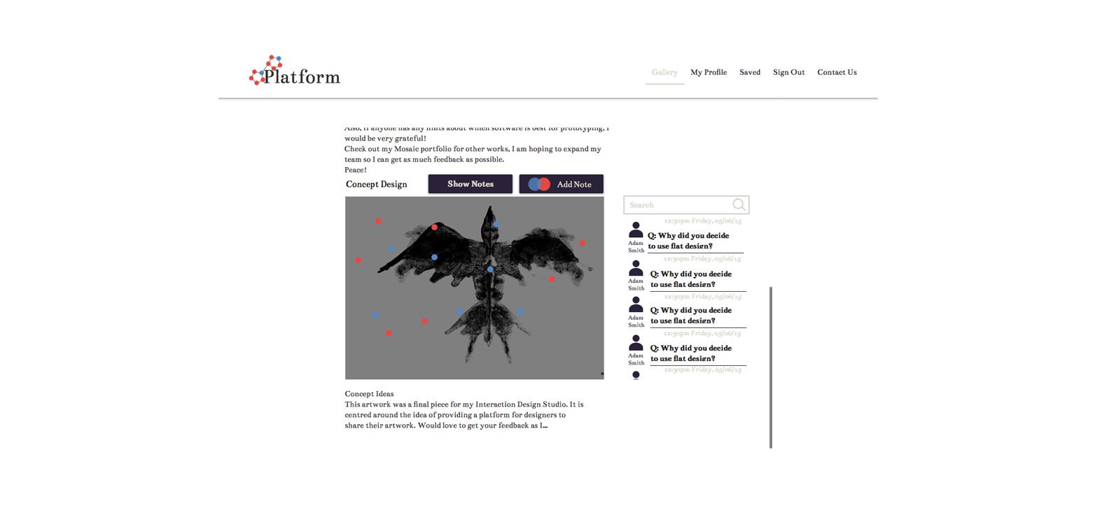
A dual focus on community and design collaboration was decided, with key features grouped or omitted. The site would allow users to critique user-generated content by allowing annotation. Each user would see curated and organised designs, and a community wherre connections would be highlighted or suggested.
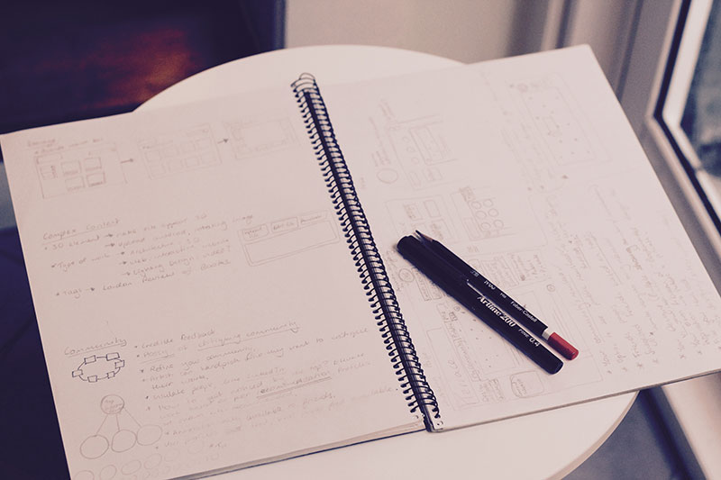
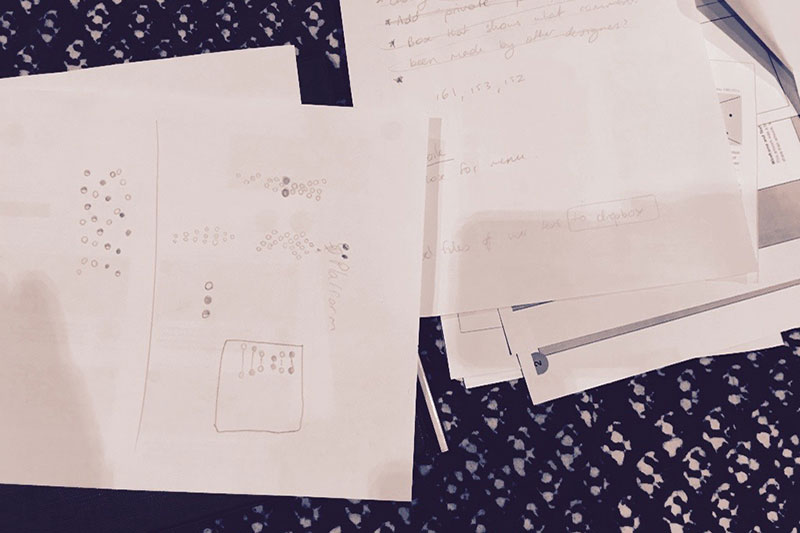
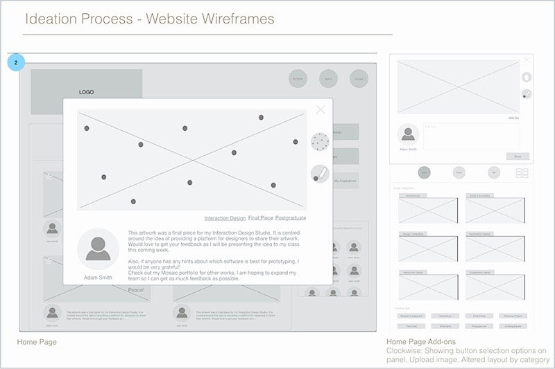
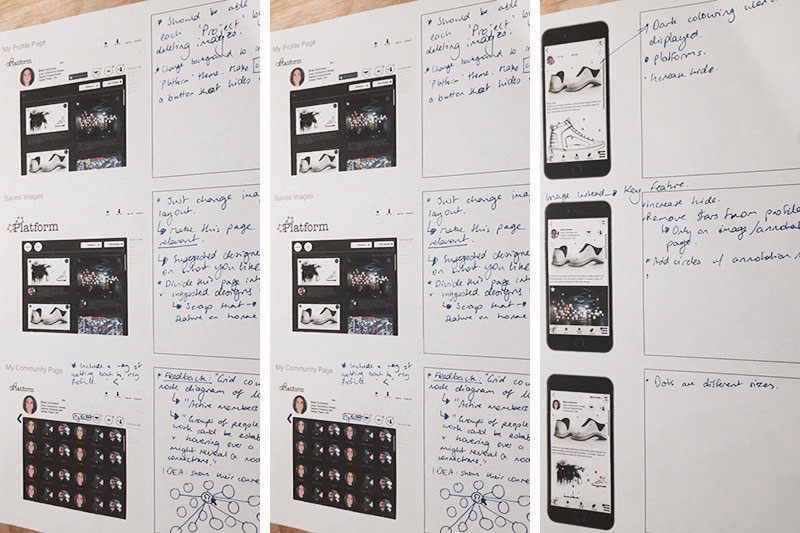
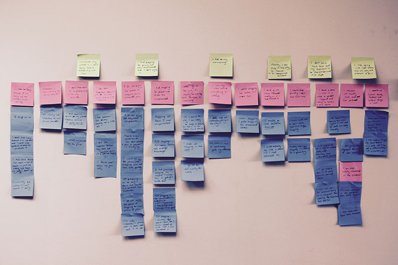
Concept sketching included branding and initial site layout that were used to define a sitemap and mood board to better define the experience of the user. Wireframes were drawn up to focus on the key features of the site: displaying designs, suggesting designers, adding notes to designs, and categorising and displaying data by category. Mobile wireframes were developed after the first round of user testing to incorporate testing results of testing.
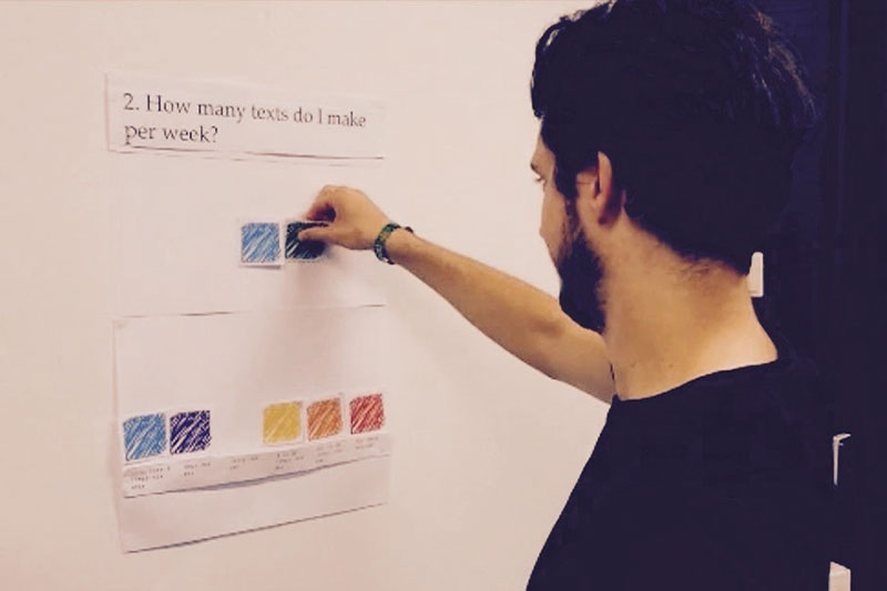
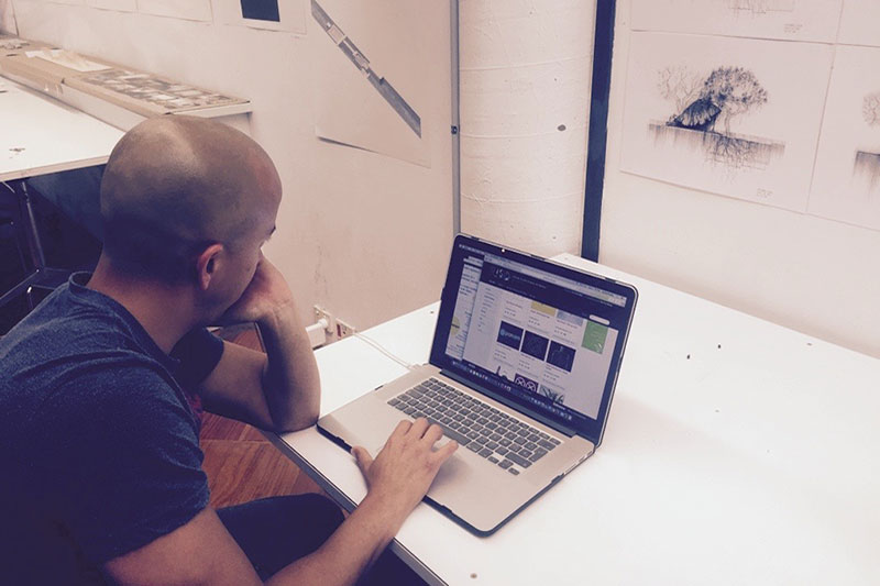
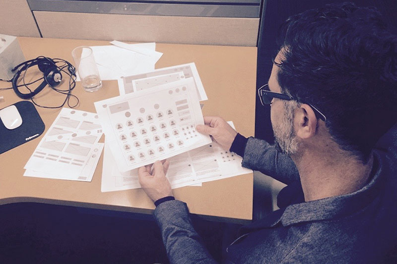
Wireframes were tested on five users using a Think-Aloud Task-based Wizard-of-Oz method, followed by a brief interview. All were recorded, including the time taken to complete each task. Interesing key responses and UI difficulties were categorised for design iteration and a second round of testing.
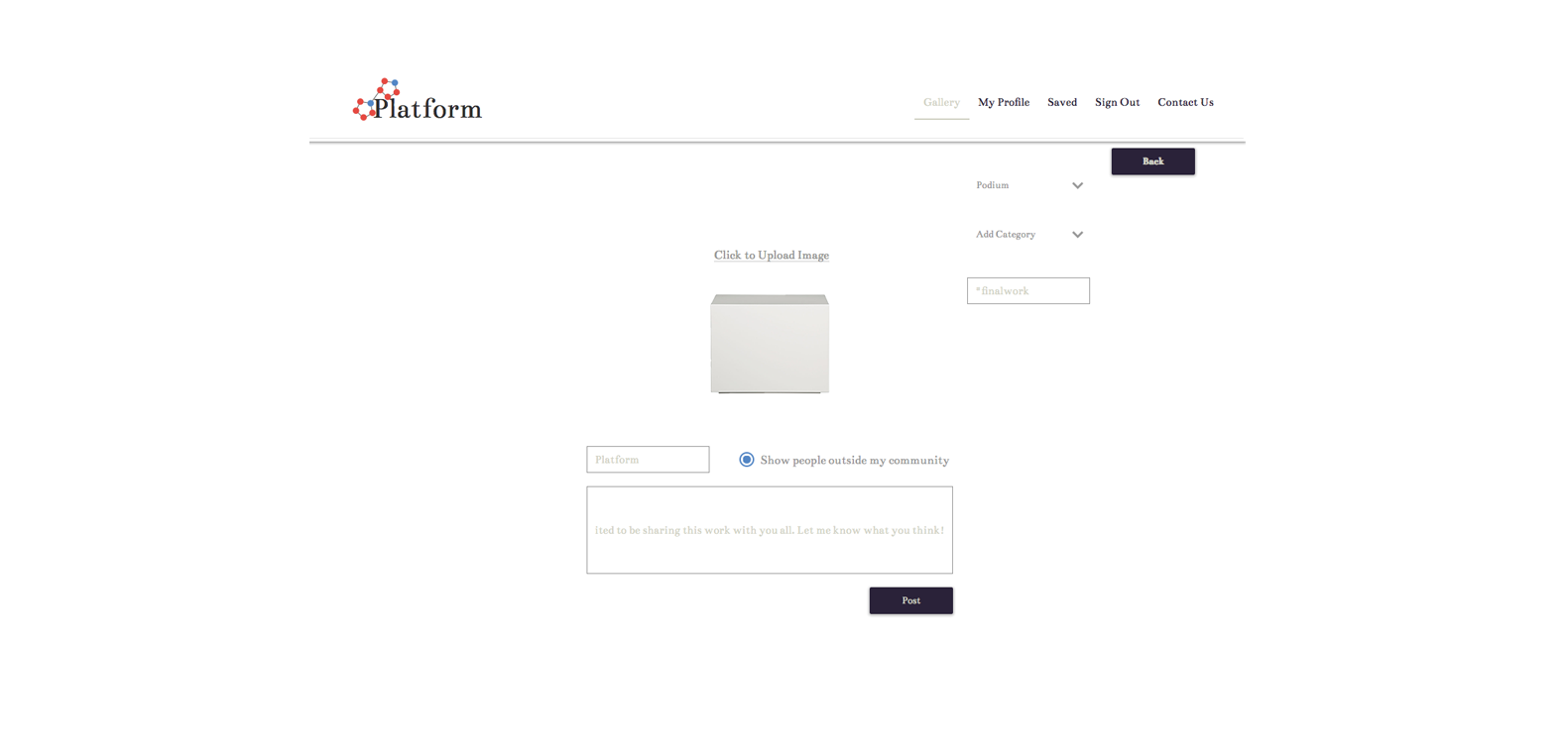
To convert the wireframes into initial mock ups, I explored interesting branding choices to pick a colour palette, font, brand name and logo design. I also included corrections highlighted by the second round of testing.
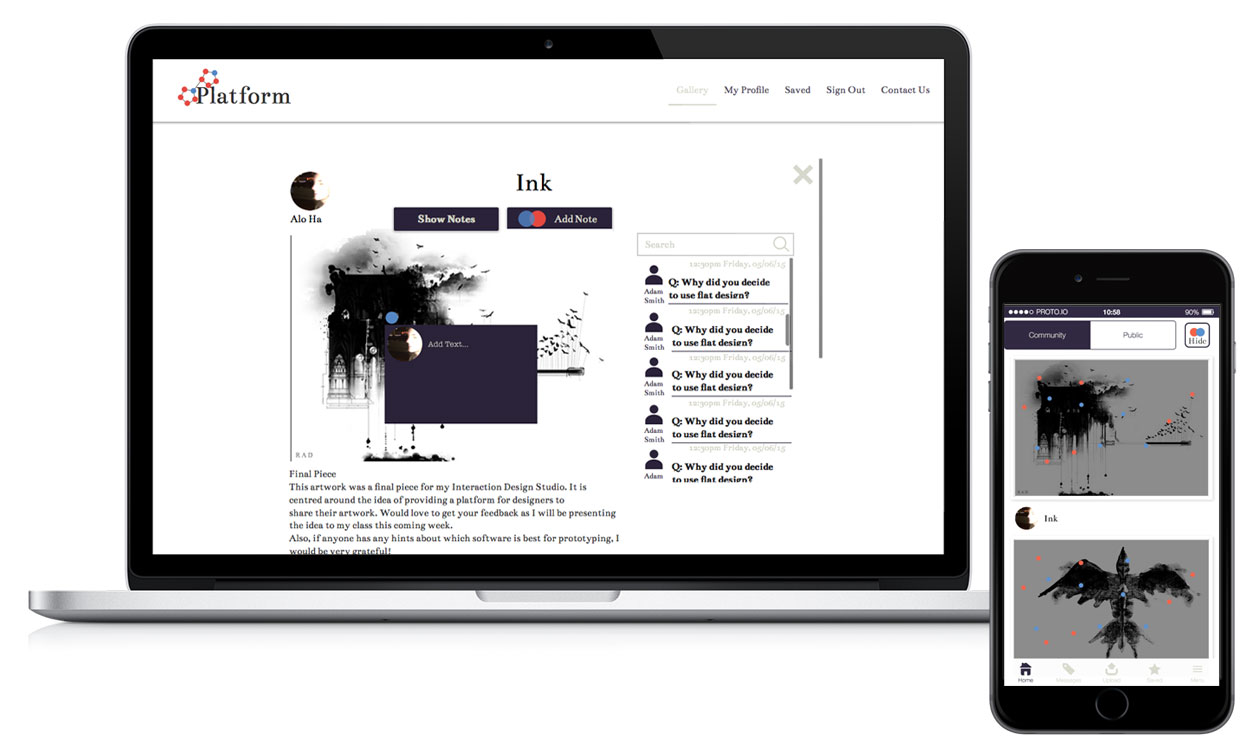
Heuristic analysis from a combination of personal, tutor and peers proved a useful catalyst for brainstorming improvements to each element. This led to the addition of one key feature: the Platform. It provided a general theme that brought the brand, concept and design together. I used a gallery backdrop, to allude to various design platforms, making the site a parallel presentation option for all design students.
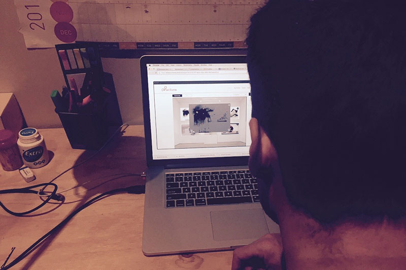
Testing on a further two users was completed after the mock-up redesign and hi-fi prototype creation. I continued the same method of task-based and think aloud wizard-of-Oz, followed by a brief interview, to continue refining the design.
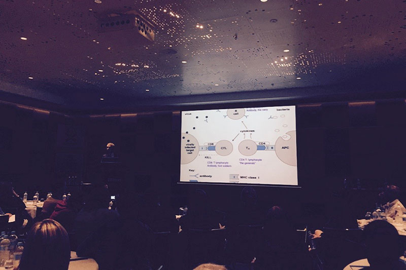
The neuroscience behind the cause of Narcolepsy has only recently been defined, and its genetic cause identified. Neurological and other physical symptoms are debilitating and can cause patients to require sleep often and at unregulated times. Some patients also suffer from a paralysis known as Cataplexy. It is currently only possible to treat the symptoms and not the cause, through a mixture of pharmaco and behavioural therapies to maximise a patients ability to function to a degree of normalcy.
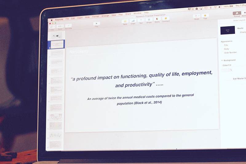
Due to the illness affecting a patients neurological function, compliance with suggested therapies can be difficult. Patient studies have highlight a difficulty for most patients living with Narcolepsy, even with the best therapies. It is therefore important to emphasise the significance of non-drug, behavioural therapies, and compliance, in the management of Narcolepsy symptoms.
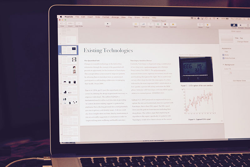
Behavioural Therapies and Compliance for patients with Narcolepsy were compared and outlined. I explored existing hardware and software technologies for many types of chronic disease management that currently measure and compile bio-data.
The lived experience of Narcolepsy as a chronic illness, was the bulk of my report. I attempted to immerse myself in the patient experience by utilising ethnographic and phenomenological methods of collecting qualitative data.
The report focuses on a thirty year old man who has Narcolepsy without Cataplexy. I used passive observation and reflection of his narrative to write an emotive ethnographic vignette at the beginning of my study. This helped me to identify categories of potential needs.
I designed a structured interview after completing the ethnographic vignette to develop a formal understanding of how he perceives and experiences his illness. After futher formal observation and the completiong of his patient logbooks, I conducted another interview. The two were then contrasted and compared through discourse analysis.
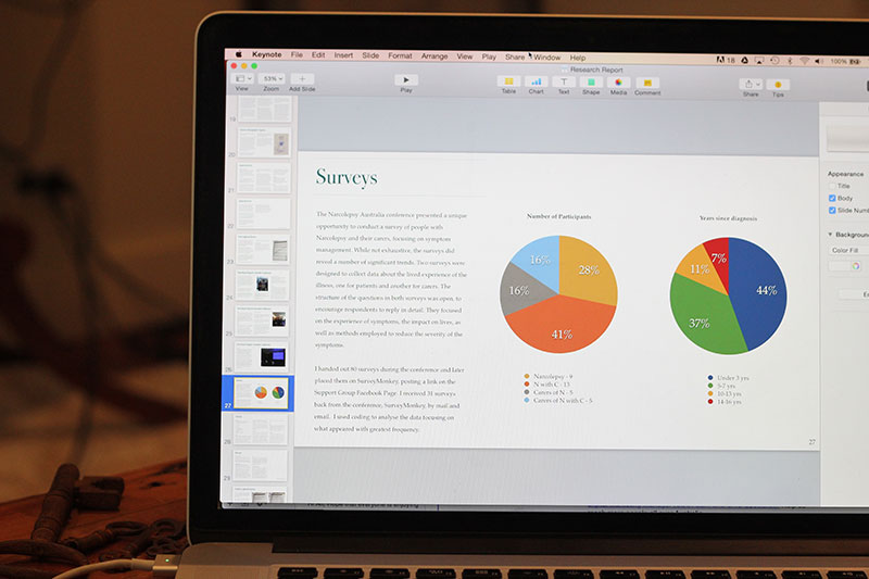
I informally observed, took notes and distributed a survey at the inaugural Conference for Narcolepsy Support Australia. It was attended by over 150 Narcolepsy patients, carers, families, and leading medical researchers in the field. The survey was used to collect phenomenologically reflective, qualitative data on the lived experience of these people and their carers. A coding method was used to derive a meaningful outcome from the survey results which were amalgamated with the initial interview and logbook data, to construct the final interview.
An Inclusive Design approach was used to transform the background and user research into a list of difficulties and needs for patients with Narcolepsy. Illness management techniques most commonly employed by patients include monitoring medication and nap times, coupled with behavioural techniques such as monitoring diet, exercise and social engagements. Other difficulties in understanding the illness can come from observing and recording success rates of various medications or medical practitioners.
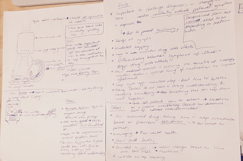
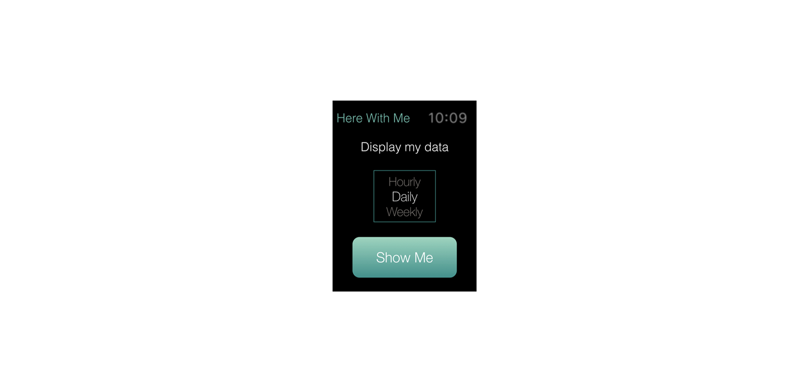
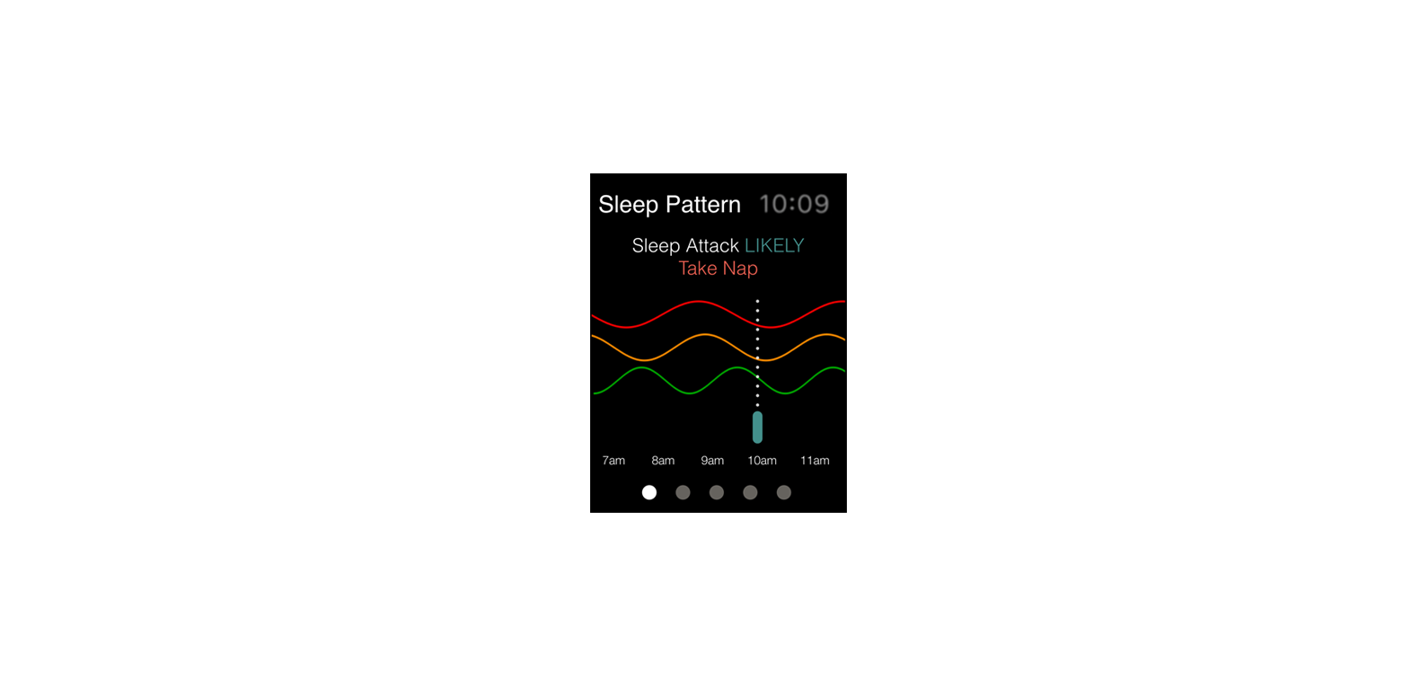
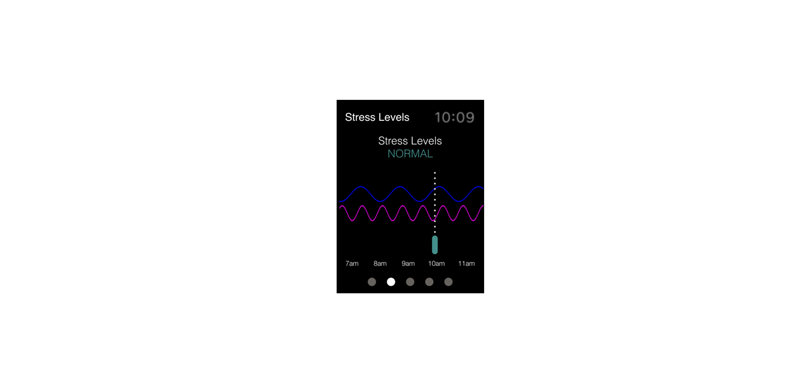
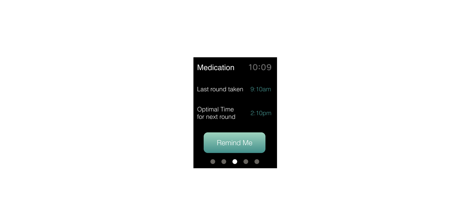
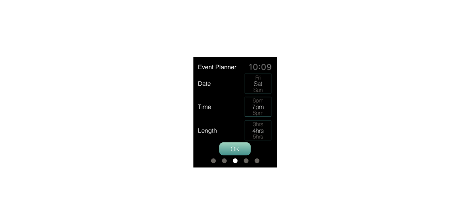
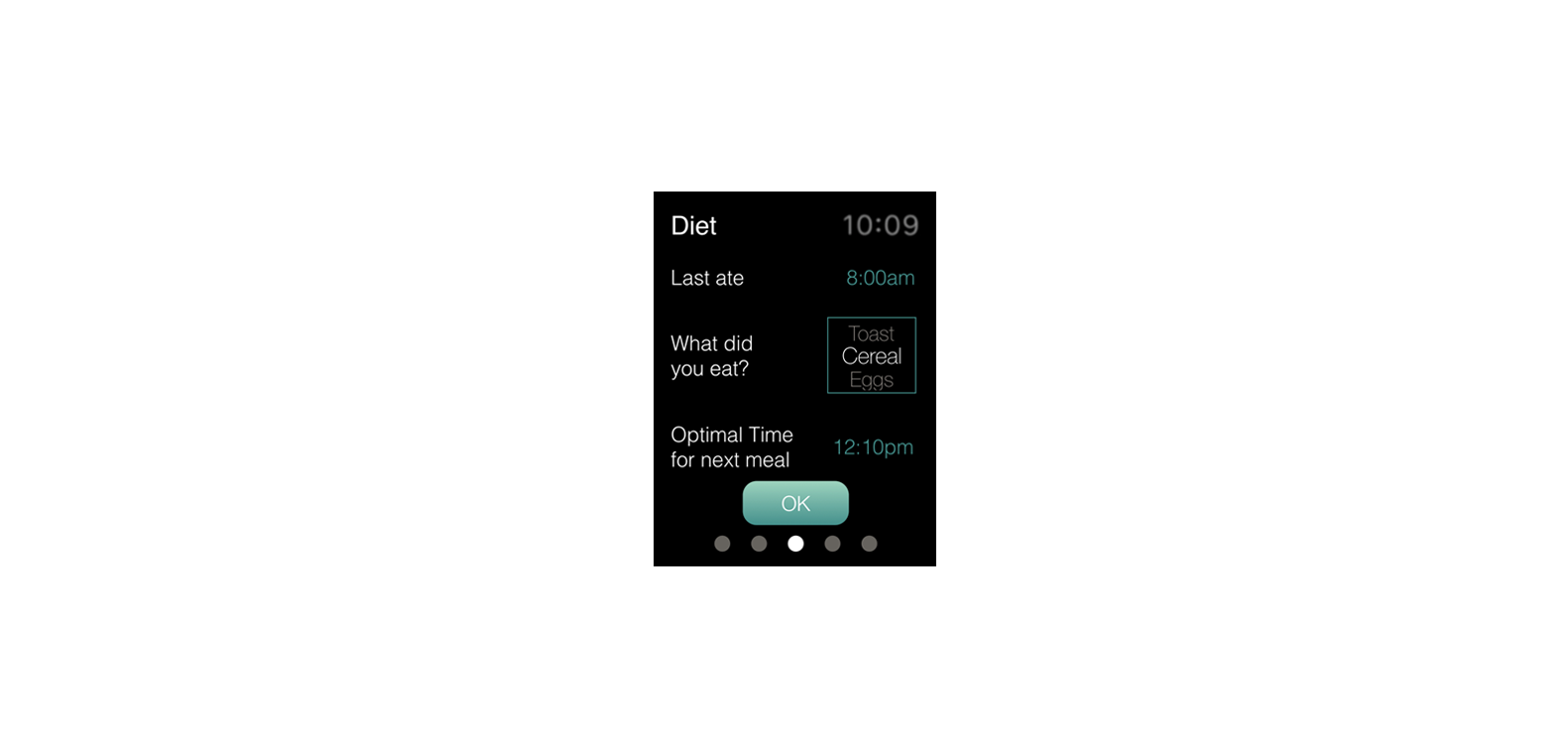
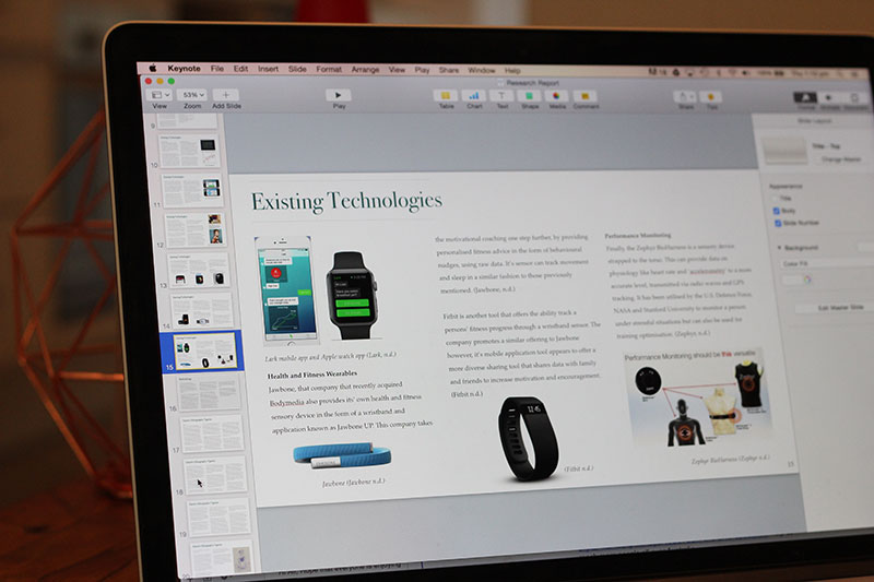
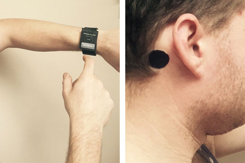
The list of needs was used to begin concept sketching for a non-intrusive, bioinformatic wearable device that could interpret the data and communicate it to patients in real time, on an Apple smart watch interface. EEG data is used as a way of monitoring and displaying a patients brain activity and sleep cycle.
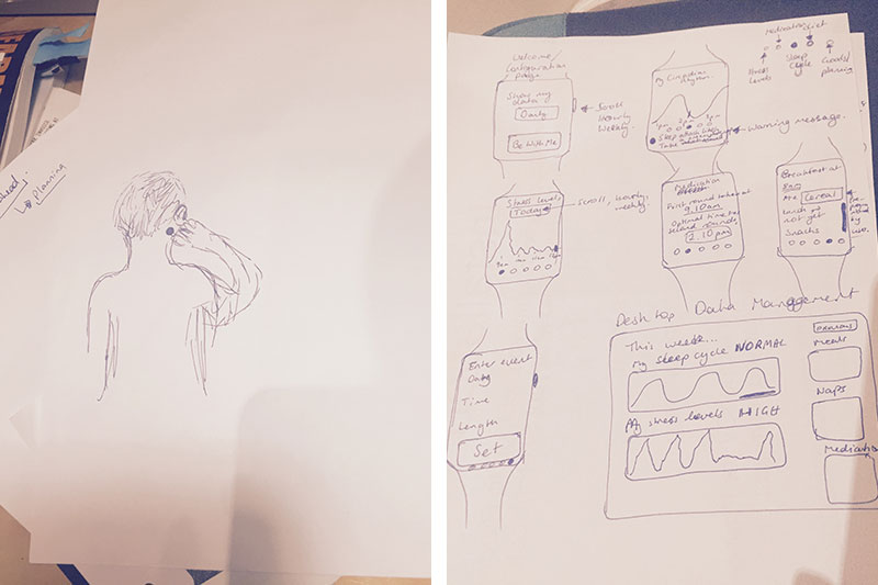
The display would include translated EEG readings, stress levels, circadian rhythm cycle and daily activities. These could be used to warn patients of an oncoming sleep attack, allow users add daily or weekly goals or events for the device to tailor its recommendations of medication and sleep times. The interface would also allow user input, without this being the main focus.
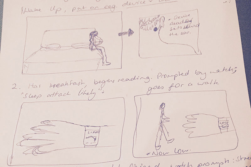
A Lo-fidelity prototype was developed through mock ups of the interface, and a sensor that would sit behind the ear of the patient. User Testing was conducted through Think-Aloud, Task-Based-Wizard-Of-Oz testing, the time and ability to complete each task was assessed. The user was also asked to wear the sensor prototype behind his ear for half an hour and comment on his experience. Further research would be required into current understanding on EEG data and how it can captured and translated.
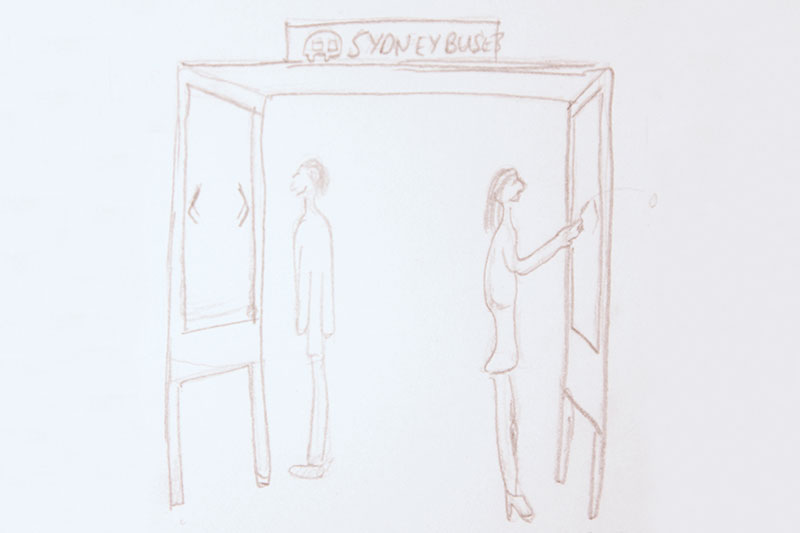
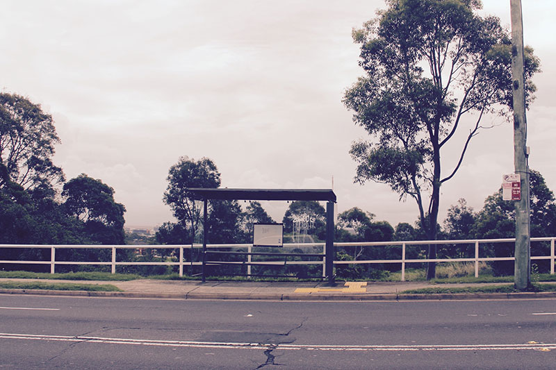
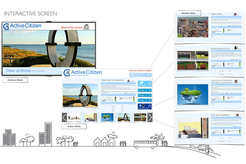
The bus stop of the future, a gateway to communities, is in question. Whilst technological advancements have ensured that urban environments throughout the world are changing at a rapid pace, transport interchanges, namely bus stops, appear to be stagnate. Through creative design and user research, they could be transformed from passive structures into ones that serve the community in which they exist. A group of academics and students throughout New South Wales had the opportunity to propose, test and develop their own designs for a previously determined structure with an interactive screen using Microsoft Kinect’s depth perception.
The first step was to clearly define the problem by conducting some initial research on both the concept of communities and bus stops within them. The result then defined the research scope, which was to mobilise communities through leveraging the proposed improvement of bus stops. A Competitor Review highlighted proposals from design teams around the world that would redefine transport interchanges, from building virtual communities and town halls, to challenging citizens with ideas. I noticed a common theme of promoting a sense of agency or change in behaviour within a community. Literature Reviews of articles also highlighted the expanding role that urban screens could play, beyond advertising, in constructing meaning from the physical place and contribute to virtual and physical communities.
The research was used to formulate interview questions, forums and observation of potential users. Their responses were used to create an affinity diagram to find a cohesive set of issues. The synthesised issues discovered were: no sense of agency within communities, difficulty mixing technology with physical presence, and improving the public transport experience. Three prospective user personas and their journeys were created based on the information attained from all three methods of research.
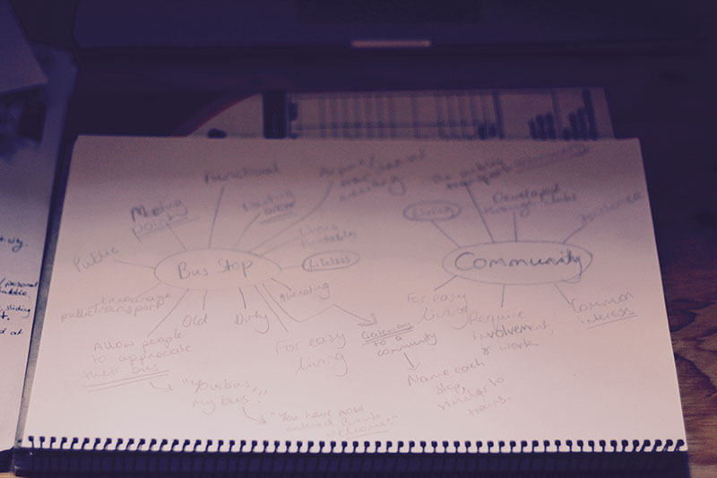
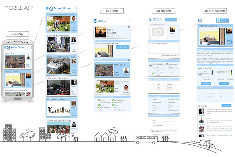
The challenge was to use a bus stop to develop a sense of agency within physical communities by integrating them with virtual ones. This inspired the idea for a platform that encourages members to propose solutions to challenges, or issues, within a local community.
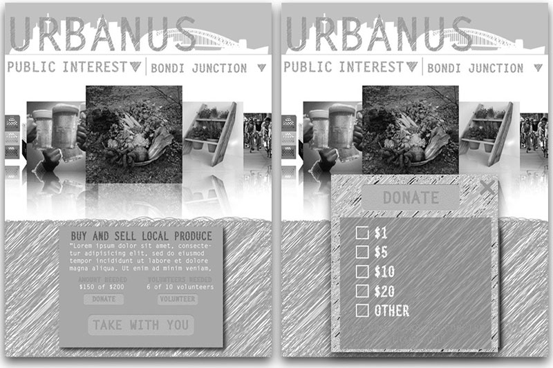
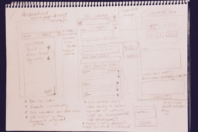
Initial sketches were made for an interactive urban screen app that provides crowd-sourced funding to implement solutions to local community issues, with a mobile extension for users to access their virtual community away from the bus stop. Wireframes for both the interactive screen and mobile app were created using Illustrator.
Before User Testing, the concept proposal was presented to peers to help refine both the idea and design. The interface evolved through mock up iteration, highlighting any oversights or flaws. The colour palette and brand name were left until the UI elements had been compiled.
User evaluations were conducted at varied stages of UI design. The methods used included interviews during testing of both lo-fidelity and hi-fidelity prototypes, user co-creation on lo-fidelity mockups, and Think-Aloud Wizard-of-Oz interactions with paper mock ups.
The bus stop interface was prototyped using Processing, an open source programming language. The interactivity is controlled by a Microsoft Kinect that is included in the final bus stop structure design from the brief. The final design called for RFID technology to scan the user's transport (Opal) card to register payment, which was not included in the prototype.
The mobile app prototype was developed using the online software Proto.io.
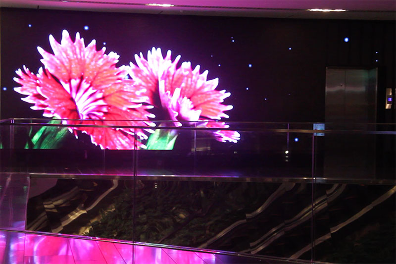
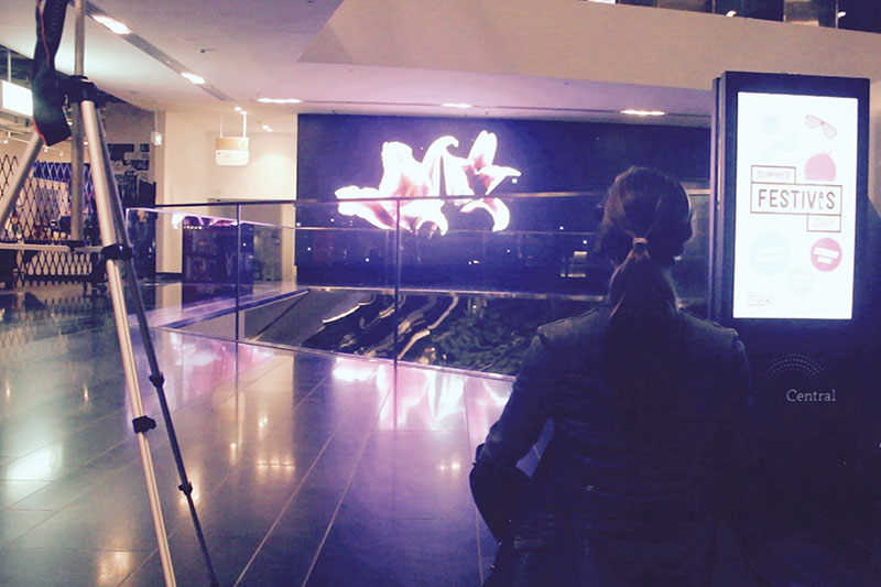
Central at Central Park has commissioned a curated digital art program for a digital wall inside their “Living Mall”. The title of the program “7mm Pitch” refers to the distance between each pixel that forms the 16 metre digital wall. This “Mind Paintings” commission involved a Studio of classmates and I each creating an application that could be controlled by the mind, and run for a month for the public to engage with. Neurosky’s Mindwave is a portable electroencephalograph (EEG) with an algorithm that converts brainwaves into Meditation and Attention levels, with the project to focus predominantly on the user’s ability to meditate.
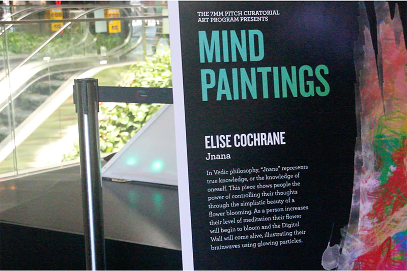
The opening of a flower was chosen taking the user’s environment into consideration- a Living Mall. The natural world encourages the user to calm their mind in order for a flower to open. The public has a varied experience with meditation, so to allow for this the user’s Meditation levels just need to show an average increase from their initial readings for the flower to open. If the readings begin to decline, the flower will start to close.
Due to the wall being in a public space, user testing was mostly done on smaller screens, using hi-fidelity prototypes to ensure the application performed as intended, changing speed and accuracy to enhance the experience. Two trial runs were also used for final changes, along with some informal interviews of the members of the public.
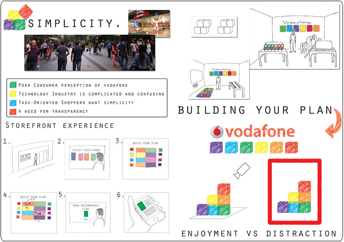
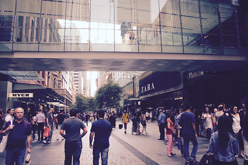
A major Australian Telco’s two main stores in Sydney’s CBD are not experiencing the foot traffic expected. This company has spent a large amount on the stores to play a role in their retail path, but want to engage progressive and curious people outside this path to purchase. Instead of relying on special offers to increase footfall, the stores need a more engaging message that reflects their cool brand. The objective is to create a store-front experience that people will want to interact with before they have time to reject the brand. This design needed to include a data collection for the company, and a take-home component for the user. Brand agnostic mobile devices and plans need to be at the core of the experience, using communication that is “brave, straight-up and caring”.
I completed this component of the project individually. I first attempted to understand the drift to online retail that gave rise to a different set of questions. What is the new function of traditional bricks and mortar stores? How do they serve contemporary consumers? How do they support Brands? A number of journal articles and media all come to a similar conclusion: there is a digital drift in retail that is only escaped by stores that provide an experience valued by the consumer, a personal and fulfilling interaction. Research shows that users view shopping for mobile plans to be of a task-oriented nature, therefore interactive designs with limited arousal would be most effective.
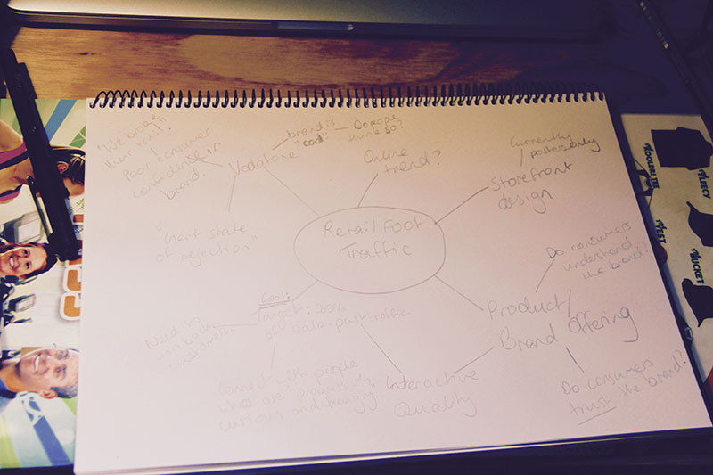
Three methods were chosen to better understand the lack of footfall in-store. An initial online survey of a sample of the population was collected to gauge user shopping behaviour and habits. Observation of passers-by and contextual enquiry interviews from popular stores helped me to understand why these store interactions were popular. I then used brief, semi-structured interviews of members of the public to understand their perception of the brand, and store memorable interactions. A recurring response of poor brand perception causing low public trust was noted. Key responses from all three methods were compiled into an affinity diagram to determine the key themes: disinterest in provider, overwhelmed by city environment, time poor, desire for “cool” experiences.
We joined a team and combined my research with theirs to confirm that the design will need to reflect a clear and simple interaction for the user to simplify the Telco’s many messages. We then researched possible styles of design that could fulfil these requirements, focusing on Brygg Ullmer and Hiroshi Ishii’s Tangible User Interface.

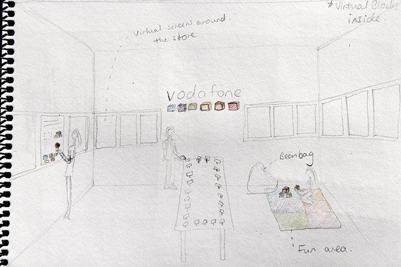
Our concept taps into the tactility and simplicity of the very familiar activity of building with blocks, by utilising the affordance of physical blocks to help users build a phone plan. We used a storyboard to divide the design concept into two parts: the initial interaction outside the store, through a touch screen, and the tangible in-store interaction with aesthetically pleasing and playful physical blocks for the task-oriented shopper. This initial concept was presented to industry professionals to obtain feedback on elements that required further thought, with a positive response.
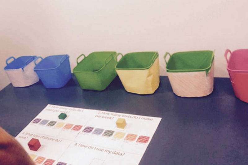
Sketching and more storyboarding were used to develop the user's journey of multiple interactions. Through ideation, the design was split into three elements: physical blocks, virtual blocks, and sound.
We created lo-fidelity prototypes using paper to simulate user interactions. The virtual and physical designs were tested separately to reduce bias. User testing was done through a Think-Aloud Wizard-of-Oz technique followed by a semi-structured interview, each test was filmed. We divided interesting observations and interview highlights by physical and spatial form, visual aesthetics and content, technical function and performance, interaction, and experiential. Heuristic Evaluation severity ratings were used to rank and correct any misleading elements of the design.